Ashby Grant
Numbers you can plan around.
Ashby Grant is a 14-person tax and accounting firm in a small Ohio city. They do taxes, bookkeeping, payroll, part-time CFO work and IRS help for small businesses and the families who own them. The site had to look settled and trustworthy, show real prices, and make booking a first call easy.
- Services
- Squarespace website
- Industry
- Accounting
- Platform
- Squarespace
- Scope
- Home, services and pricing, insights magazine, team and contact; service ticker, price cards, FAQ, newsletter signup, contact form
- Project
- Concept website
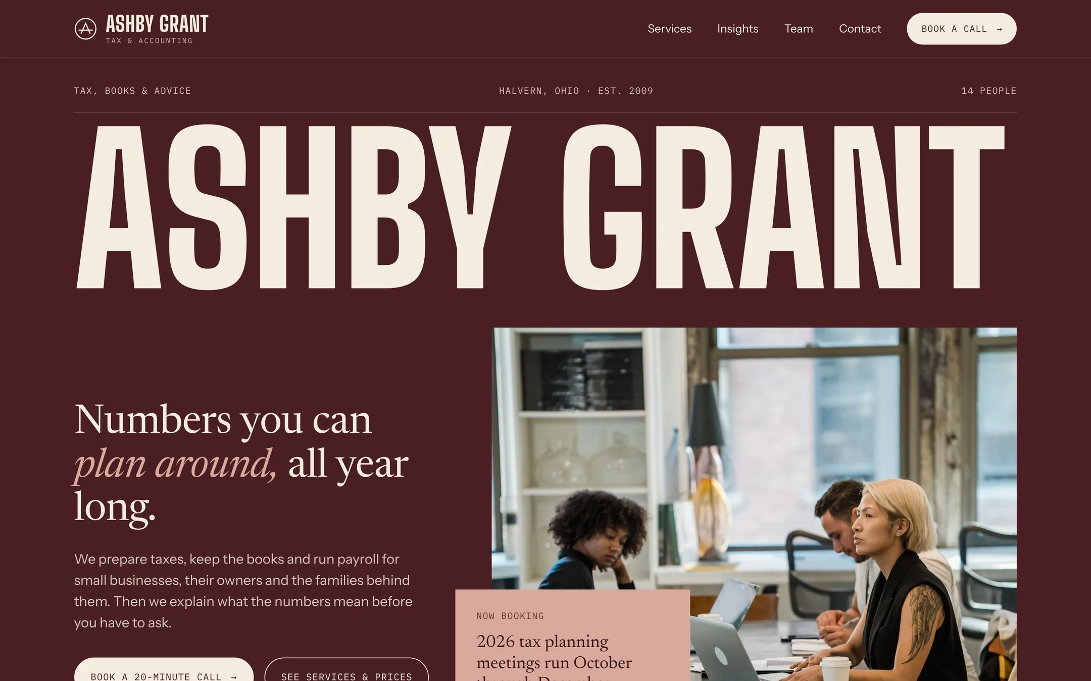
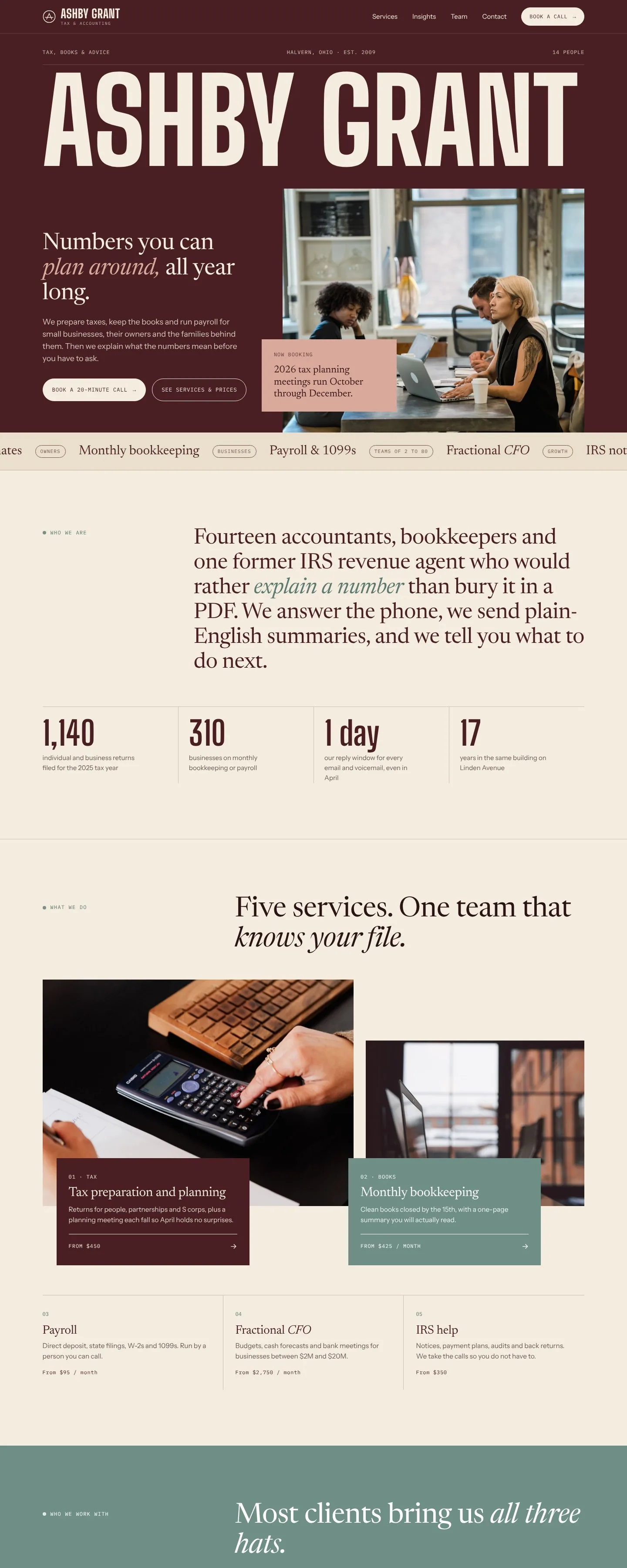
Homepage
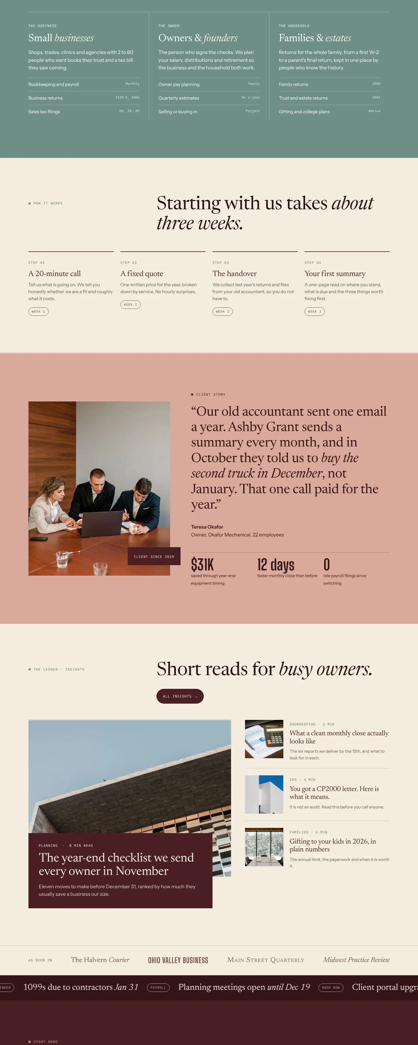
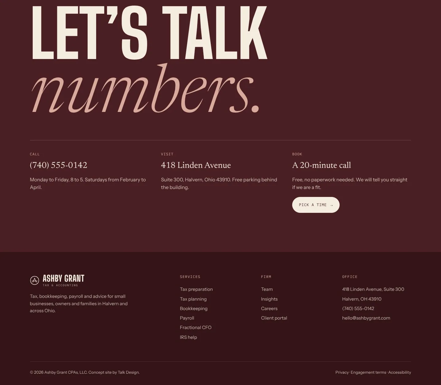
The firm's name runs edge to edge in tall condensed letters on deep oxblood, with a calm serif headline and a team photo below it. A slow ticker lists the services, and colored text panels overlap the photos so each section reads like a page in a magazine. Sage and dusty pink sections break up the long scroll and mark who the firm serves, a client story and the booking details.
Inner pages
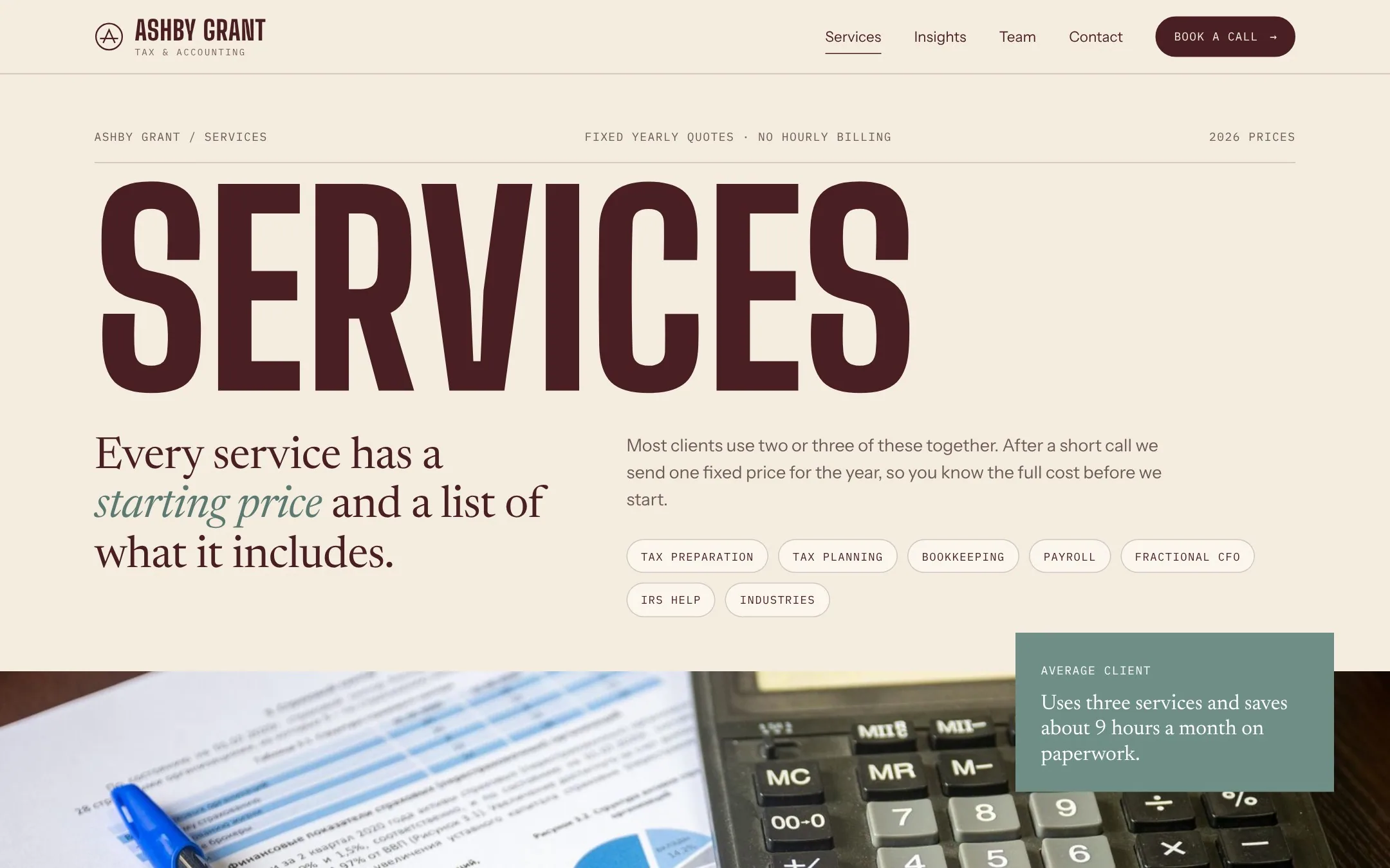
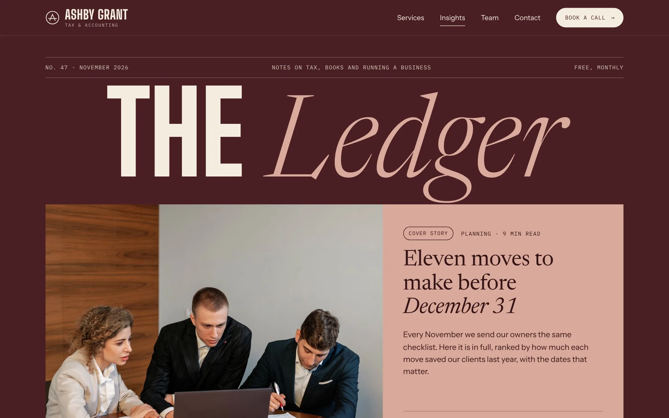
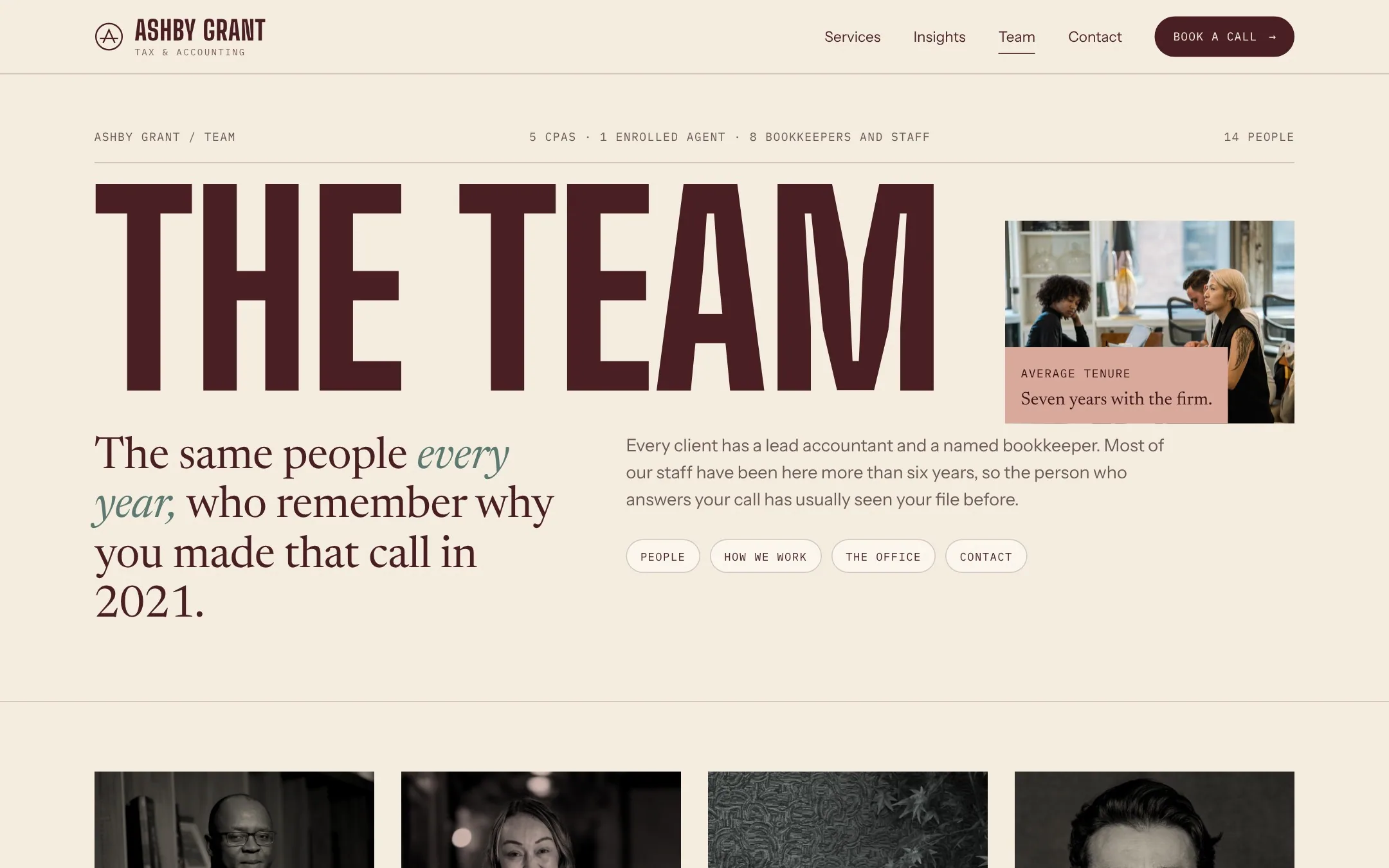
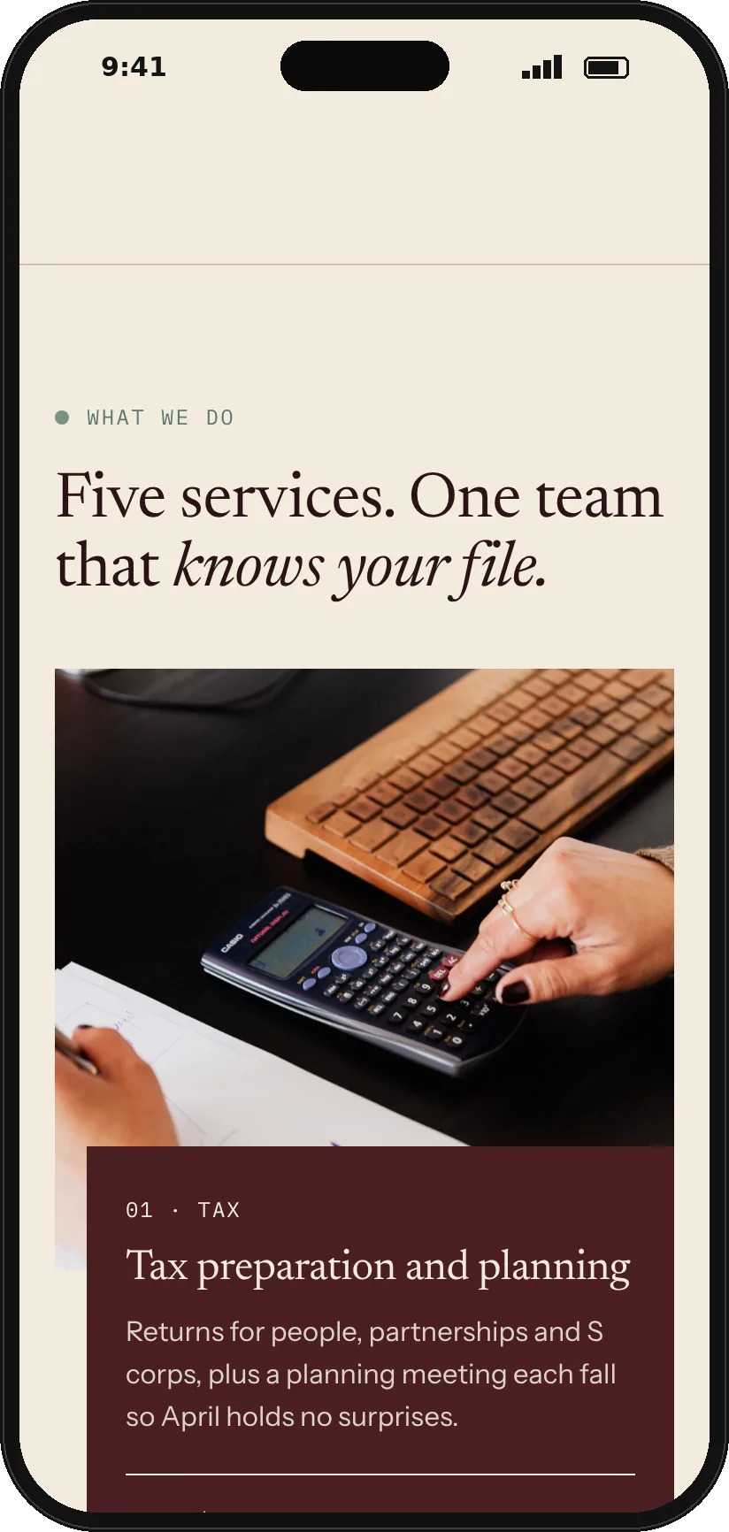
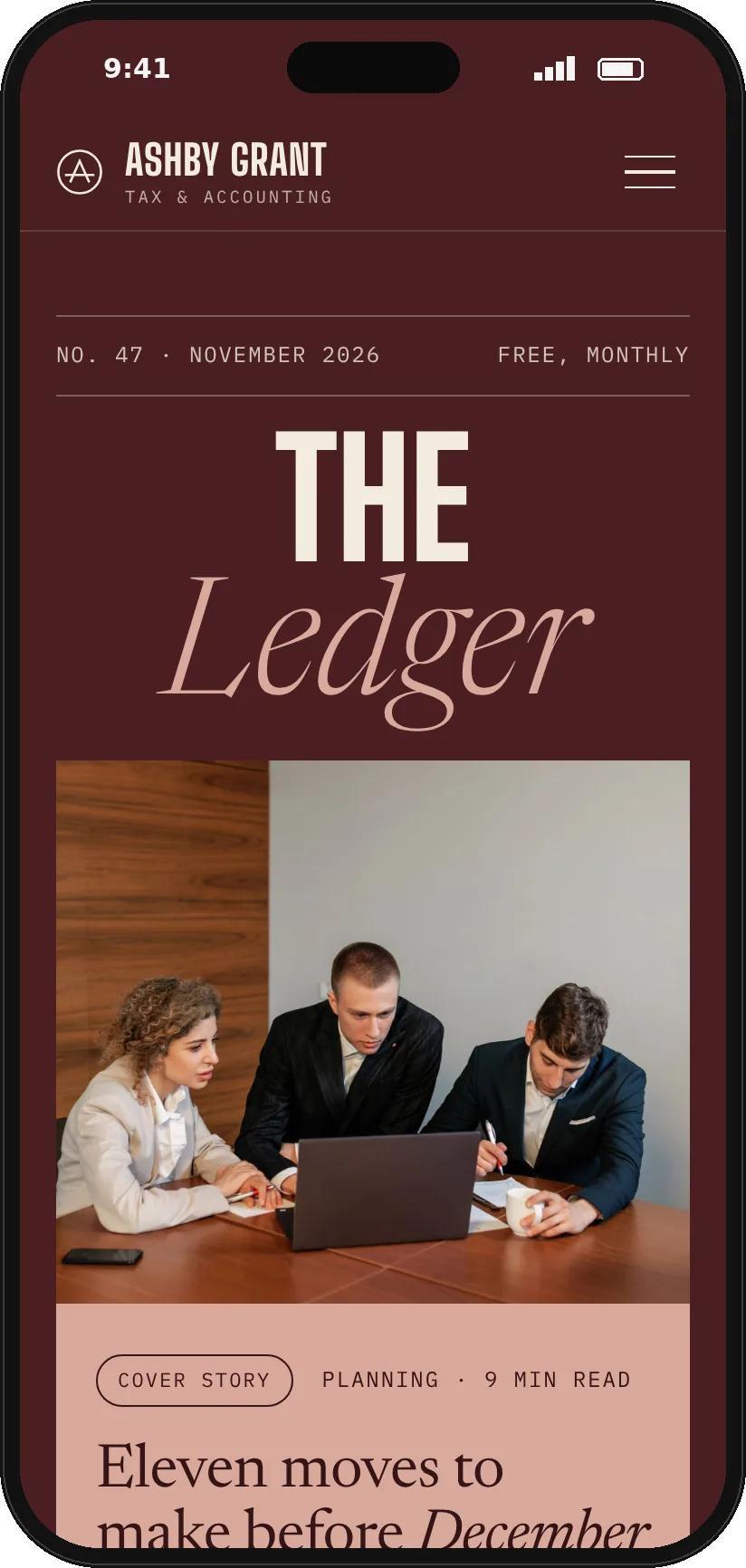
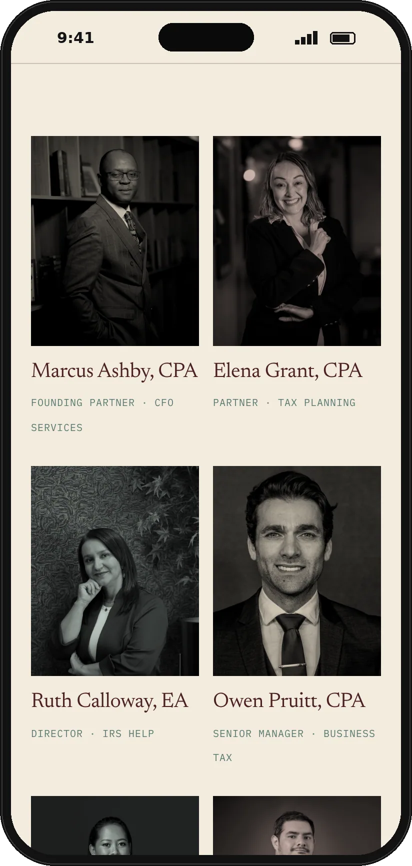
The services page gives every service a list of what is included and a starting price, then covers industries and common questions. The insights page is set up as a monthly magazine with a cover story, and the team page pairs warm black and white portraits with the firm's written promises, office details and a contact form.
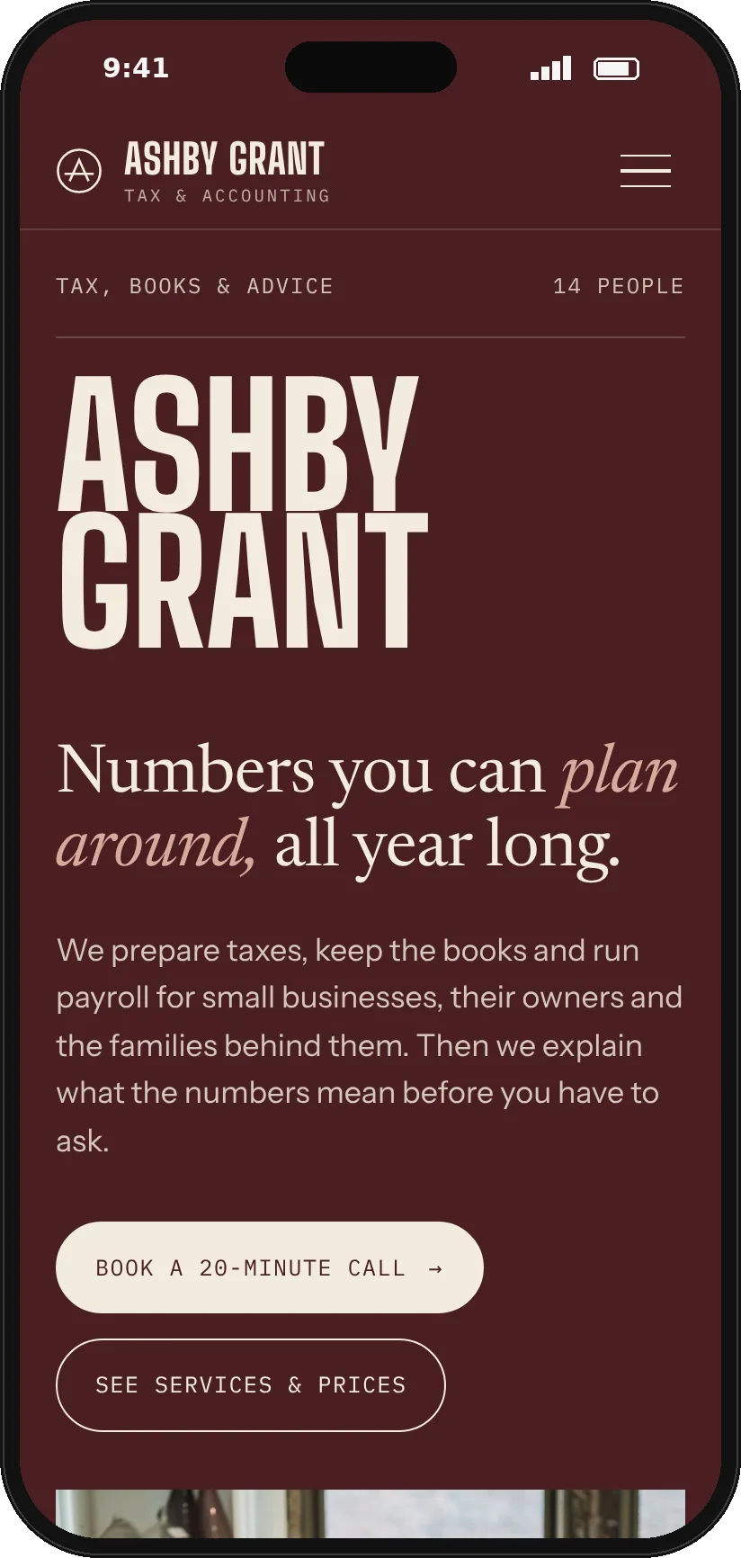
Mobile
On a phone the wordmark breaks onto two lines and the overlapping panels stack under their photos. The team grid keeps two portraits per row, so the page stays personal on a small screen.
Want a site like this for your business?
Concept project. Ashby Grant is a fictional business, made to show how Talk Design would build a site like this. Photography from Pexels.